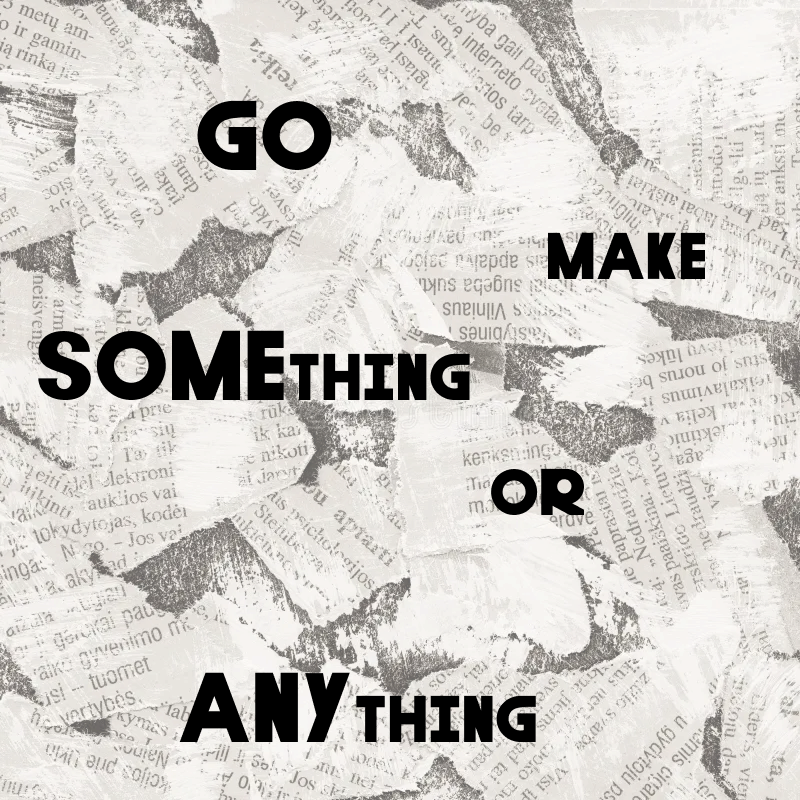
Turner Typeface
I made a typeface. It's harder than it sounds.
Typography 101
Why do we have strong feelings about Comic Sans? Why has Times New Roman persisted for over 100 years? How did Helvetica get its own feature film?
So many good questions.
I know you've seen the billboards that clearly illustrate why Font Choice Matters. When I was invited to a workshop on typography and how to create a typeface, I jumped on the chance to learn a new design skill.

Step one: understand the etymology of a typeface.
Step two: as with all design work, start with inspiration. I really love the perfectionism, roundness, and uniformity of a Century Gothic or Poppins, so this is what I set out to create. This is important for later, when you note that Turner looks... nothing like these.
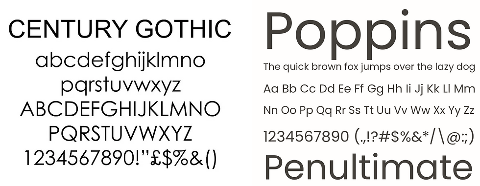
Step three: you're supposed to start with the letters H, O, and V to get a rectangle shape, a round shape, and a triangular shape, which form the basis for all of the other letters. I'm a big old rebel, however, and started with R, P, and H.
I worked in Figma, combining shapes and using the addition/exclusion tools to end up with a vector for each one of my letters. Fun fact, this is the order in which I did all letters:


Step four: I repeated the process for lower-case letters, and then for numbers and symbols. My lower-case letters (and truth be told, numbers) were truly, and I can say this because they're my own, unhinged. I'm not even going to give them airtime here. But symbols were more straightforward, and I even learned their proper names, full stop.

Step five: I uploaded all of the vectors into Glyphr Studio, simultaneously tedious and rewarding to see come together. Since my lower-case letters were -cough- not so successful, I decided that Turner was destined to be an all-caps typeface. Glyphr generated the lower-case letters, but they ended up the same size as the upper-case letters, so it FELT LIKE TURNER WAS JUST SHOUTING AT YOU. I resized everything to the correct proportions, and changed the bearings on certain characters when needed (I'm looking at you, O.) This was quite the iterative process, toggling between the text live preview and tweaking individual letters.
But at last, it was time to generate an .OTF file, install it in my Font Book, and see it come to life!
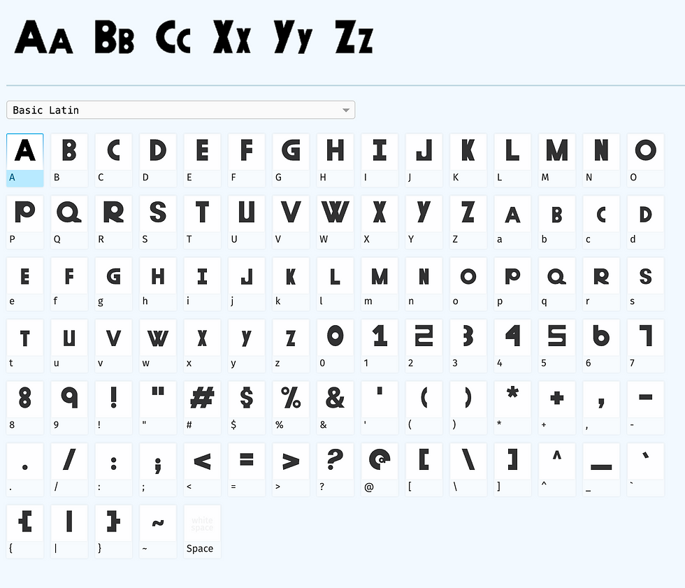
It's Alive
Typefaces best serve certain functions, and Turner is best suited for whimsical, guileless headlines. Here it is on some sample children's book covers:


For all of my creative friends, here's a reminder to: