

Logo Design Work
Look. This mini-project was headed toward my Other Projects > Bad UI in the Wild collection, but after completing the work, I decided it gets its own page.
I do not have an infantile sense of humor. Perhaps this stems from growing up in a all-female household. Perhaps this has continued to cement now being the matriarch of a household of all males.
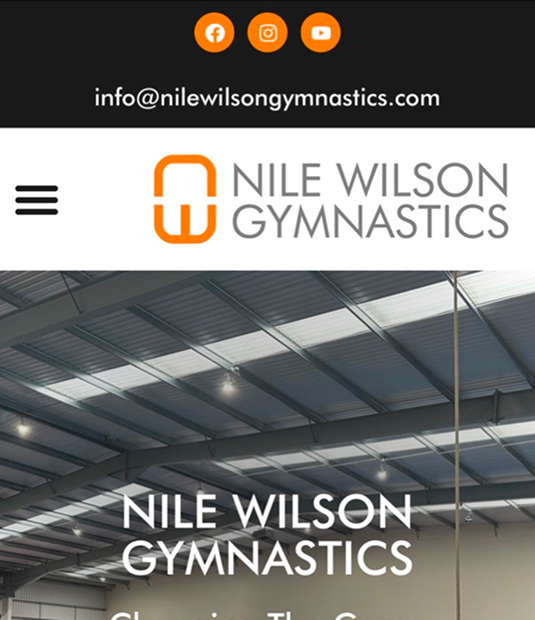
But this logo sure caught me off-guard.
I've been enjoying the content of Nile Wilson, a former Olympic gymnast out of the UK. He and his gymnast pals try to recreate the physical feats other content creators post, and their upbeat attitudes and 50% success rate sum up to 100% entertainment.
However, I happened to click on the link to his website from one of his videos, and. Oh Mylanta. Is the proverbial emperor with a lack of vestments walking away from us? Font choice matters, people.
So I set out to redesign the logo.
Design Principles
-
I wanted to follow the general shape of the original logo, i.e. a tall rectangle.
-
I wanted to keep the NW initials as the major element given his company name, so no shape or symbol replacements.
-
His company offers classes for rising and aspiring gymnasts, so the focus should be on that versus his personal and career accomplishments.
-
No room for color creativeness - as much as I disdain orange, #FF7B00 it is.
And Now for an AI Commercial Break
I've been playing around with Figma Make, because AI is taking over the world and our jobs and design is for sure one of the first things on the chopping block. "Why would someone need a designer for a logo?" You might scoff. BECAUSE THIS IS WHAT HAPPENS, PEOPLE.
Bad prompting? Likely.
But a stick figure releasing a bowling ball?
With lettering that's not even centered or aligned in the circle?
We can do better than that.


My Process
My high school art teacher was called Billie Giles. I took art all four years and senior year was on the yearbook team, which she also ran. I loved the 3D art projects - clay, painting furniture, collaging, painting with popsicle sticks, and I still have a hanging clock that I'm quite proud of.
However, drawing? Not my jam.
So imagine my visceral reaction to an assignment to drawing a coffee mug. Not once. Not twice. Nay - not even thrice. 100 times. ONE. HUNDRED. A coffee mug! One hundred times!
Since graphic design is not my primary superpower, I challenged myself to come up with 100 logo ideas following the design principles above.
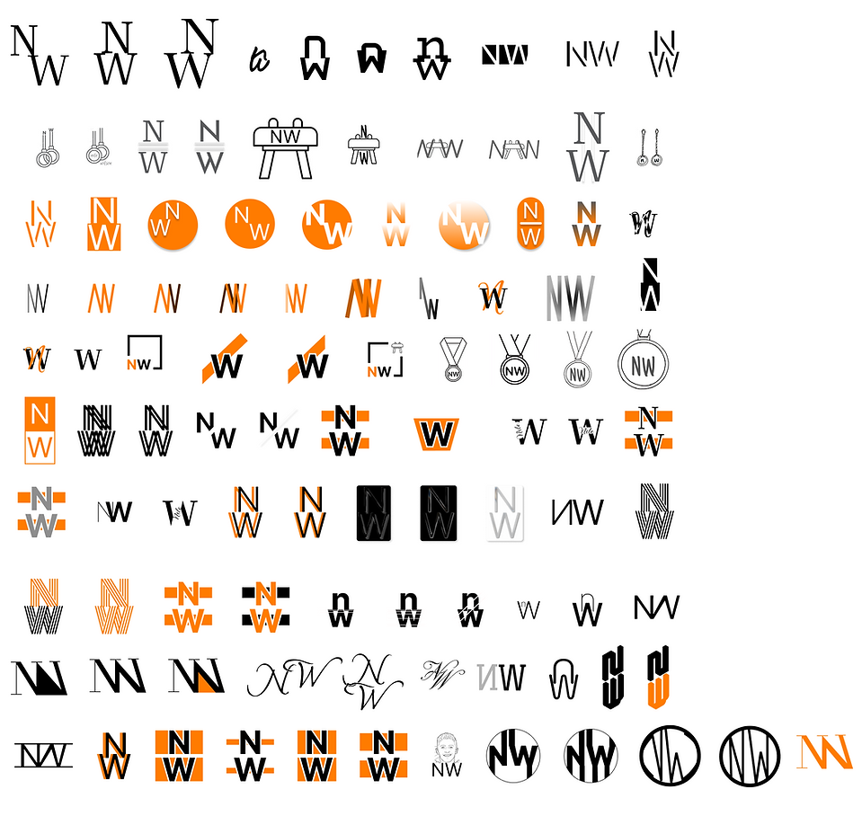
For those of you counting in the back, yes, that's technically 102.
Some of these are just terrible. (Think of the ones I deleted!)
Some of these just simply don't align with his brand/mission (I'm looking at you, script fonts).
Some of these don't scale well (a logo no-no).
Some of these are hard to read (logos need instant recognition).
I even tried liquid glass (looks great up close, like garbage zoomed out).
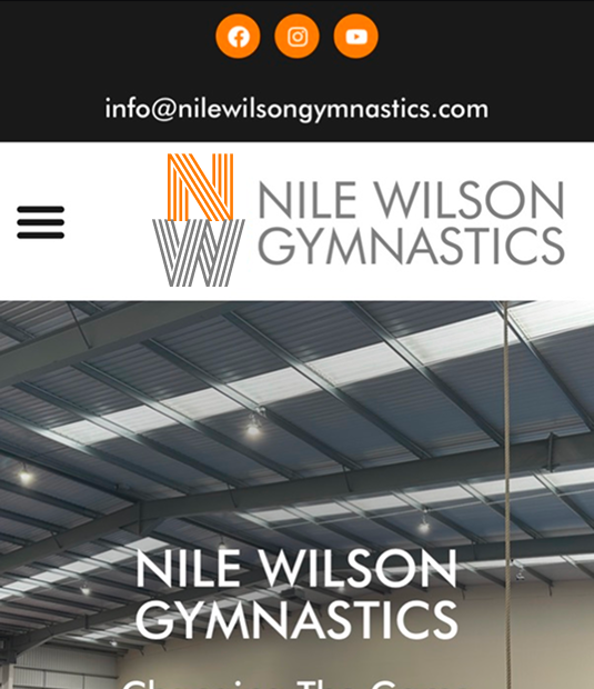
My Five Finalists
In no particular order, here are my five finalists:


Sudden Death Countdown
From 102 down to five: let's start eliminating these. As Heidi says, "one day you're in, and the next day, you're out."
5.

I actually am quite proud of this one, so I'm sad to see it go. But the serif font doesn't quite jive with the overall brand. It would be perfect for something like 'Northwest Magazine' or the 'Never Wander Ranch'.
4.

This one reads architecture or real estate firm to me.
3.
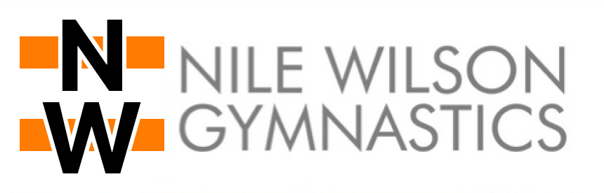
Oof. This one pains me because it's my favorite as a standalone option. The two rectangles harken parallel bars, the pommel horse, and vault; it has an athletic vibe to it; it's kind of retro and modern all at the same time. However, the black is too stark with the grey, and no matter how many combinations of orange and grey I tried, none of them work.
So that brings us to the FiNaL RoUnD.... you get to vote! I know my favorite...
1.

2.

Stay tuned for the results!