The Passport Program
Converting a paper-based experience into an app that still feels nostalgic, maintains a gamification element, and drives more users to the product.

"The Passport was great when we first moved to Denver," she says. "My wife and I would use it to go try new places and that's how we found some of our favorites. But then - our dog got a hold of it and I literally couldn't get ahold of anyone in the company to get a replacement."
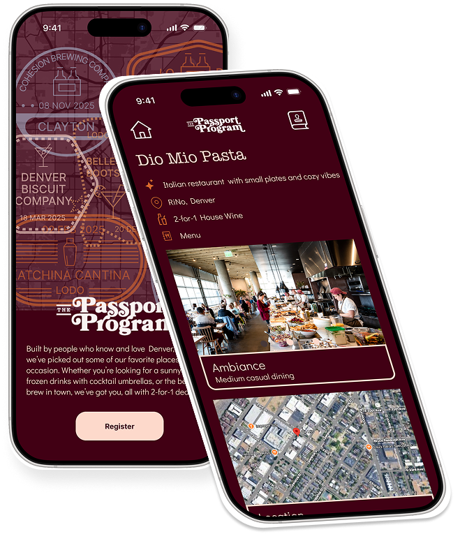
The Passport Program is a physical coupon book that offers two-for-one drinks (coffee, beer, and cocktails) at local Denver establishments. The program runs seasonally from May through October. Each year, buyers can purchase the booklet for $30. When they use their coupon, they get a stamp in their book.
As of summer 2025, the passport remained a physical asset. Clearly they must be expensive to print, but users must enjoy some sort of nostalgia and sense of adventure and accomplishment in collecting their stamps. Does this translate to a digital experience? Should it? I was on a team of three designers to figure this out.
Research
First up: user research. But what kind of users? There are the obvious: people who have purchased the Passport. Next, the folks who could be potential customers: people who like to go out and try new places and who like to get a good deal. On the other side of the equation, we have the business owners who likely use the Passport to gain foot traffic. Finally, a bit farther removed, we have people in the overall travel and hospitality industry who want to grow that sector for their individual cities or regions.
We wrote interview questions for each segment of users, and then set out recruiting interviewees. As a Denver resident, I offered to go out and find people who had previously purchased the Passport. My how? I went to their Instagram page and sent anyone who had posted a photo tagging them a cold-call DM. (Terrifying!) Surprisingly, that resulted in four user interviews. I tried a similar scouting effort for participating establishments. Not surprisingly, that resulted in zero responses.
Meanwhile, my teammates were recruiting and conducting interviews for the other user segments. All told, we ended up with:
4 Passport users
4 non-Passport users but would-be Passport users (people who like to go out and try new places)
2 establishment owners
1 industry expert
After each interview, we shared the notes or recordings from each so everyone could stay up to speed with the research. Once the interviews were complete, we regrouped to evaluate our findings. It was clear that we had a ton of good intel from the consumer side, had some good starting info from business owners, and had good context to round everything out from the industry expert. Since we had strong insights from consumers, we decided to focus on them for the time-limited project (three weeks). The main pain point for bar and restaurant owners was getting more foot traffic in the door - so if we solved the consumer side well, it would also solve the owner equation.
With that, we decided to take the work of synthesis and tackle it as a team.

At first, the thought of affinity mapping in a group was daunting. How would the logistics work? What if we got locked into a stalemate and couldn't agree on something? But we stuck to the basics and started by writing our Post-Its into FigJam and then talking each one through to find its category. Slowly but surely, themes began to emerge.
From there, we were able to develop our persona. Meet Alex!

We then summarized Alex's pain points via our problem statement:
“Alex needs a better way to save money while finding new establishments with great ambiance because they want to have enjoyable experiences with their friends.”
The final element of our research synthesis was developing Alex's task flow. Alex needs to find a participating establishment, understand their offered deal, visit the establishment, use the deal, and then be able to see all of the stamps that they have collected.

Phew! That was a long data analysis session. We were proud of our teamwork. Would high-fiving in person be awkward? Maybe. Over Zoom? 100%, and I'm here for it.

But a user experience researcher's work is never done. In parallel to user research, we were also conducting competitive and comparative analysis.
On the competitive front, we looked at:
-
Groupon: obviously a huge player in the couponing space
-
The Eat & Drink Passport: a second Denver-area coupon book that includes both food and drink specials
-
The Denver Dine Out Passport: same as above (!)
-
Behavioral substitutes like ordering in or making drinks at home
On the comparative front, we looked at:
-
CityPASS: offers Denver-area coupons for attractions
-
Yelp: helps consumers narrow down choices for places to go via ratings
-
BarGlance: a more nascent app that lets people see which places are busy and which places are not
Overall: this market is COMPETITIVE! So many things compete for a customer's attention and dollars. Here are the four key insights we derived:

Design
With the research phase complete, it was time to move into the design phase, starting with inspiration. Interestingly, all three of us came to the table with a different angle. My main point of inspiration was the existing physical passport itself and the aesthetic of stroke-based design. My teammate Deanna liked apps with an Apple Wallet / card-based design. Nakeia was drawn to couponing apps.


It was time to start sketching. We decided to conduct a design studio and set a timer for each of the three main pages (1. Login, 2. Establishment List, 3. the Passport itself), individually sketch, come back together and discuss what ideas were starting to come together. Based on our user research, we knew we needed:
-
A lot of imagery. Users expressed the need to get the 'vibe' for a place before deciding to go there, best expressed visually.
-
Filtering to help narrow down the list of participating establishments so users didn't have to sort through every place.
-
The Passport itself would have the nostalgic feel with some sort of digital 'stamp'.
It was then time for us to move our designs into Figma via wireframes. Deanna and I found a good rhythm in me starting the lowest fidelity versions with her following behind refining things as we went. If you're excited about those stamp designs, I was too! (Her background is in graphic design.)


At some point, it became evident that somehow with what is essentially a three-screen app, we were still managing on getting a little bit lost. (We had many philosophical discussions on 'where is home?') So we created an app map in order to show the relationship between each screen and its major components.
We also got far enough down the path that we needed to do some informational analysis to define some of the required data within the app. Leveraging the insights from user testing, we defined our filters.
We also included the most useful data for users on the individual establishment page:
-
Lots of images to convey the place's 'vibe'
-
Where the place is located
-
What types of activities the place has
-
What the 2-for-1 deal included

After the wireframes were in decent shape and prototyping correctly, we conducted some usability tests with three users. This led us to iterate on the design and make the following changes:

After that, we went into HiFi. We tested out MANY color palettes, ultimately landing one inspired by the dark tones of a restaurant at night. For font, we went with Didact Gothic, a simple yet approachable sans serif.
We also tapped into the iOS UI kit for Figma to simulate the whole flow, from app store, paying for the app, installing the app, and then using the app. Check it out in the full prototype!


Because the app evolved quite a bit while moving to HiFi and because it's a circular flow, we wanted to do another round of usability testing. Here is some user feedback we received and some changes that we made:

The final step to this project was to present our process and the work. If you'd like, you can watch the recording here to get a sense of my presentation style (as well as why I shouldn't quit my day job to go into comedy).
Next Steps
Were this project to continue, here are the things I would prioritize next:
-
Incorporate live user feedback: post-launch, I would want to interview app users, review usage data, track metrics like app downloads, usage frequency, etc. to incorporate into the roadmap.
-
Accessibility checking and adjustments: with our color palette, there are clearly some color combinations that might not align with accessibility standards. My hypothesis would be that color adjustments would be a requirement.
-
Android designs: we used the iOS kit and focused on that experience for this phase (since all three of us are Apple users), but we'd need to use the M3 kit to make an Android-compatible version.
-
I would start pulling from our prioritized MoSCoW features:

Thank you for reading! Feel free to reach out via email to discuss further.